
2025
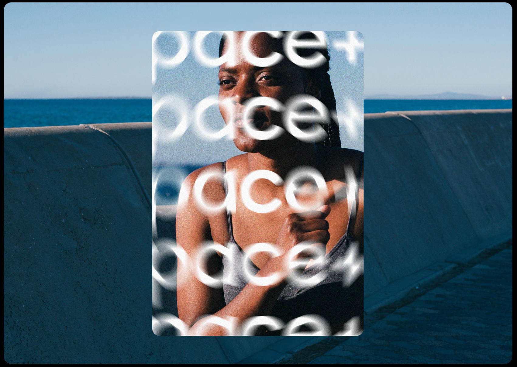
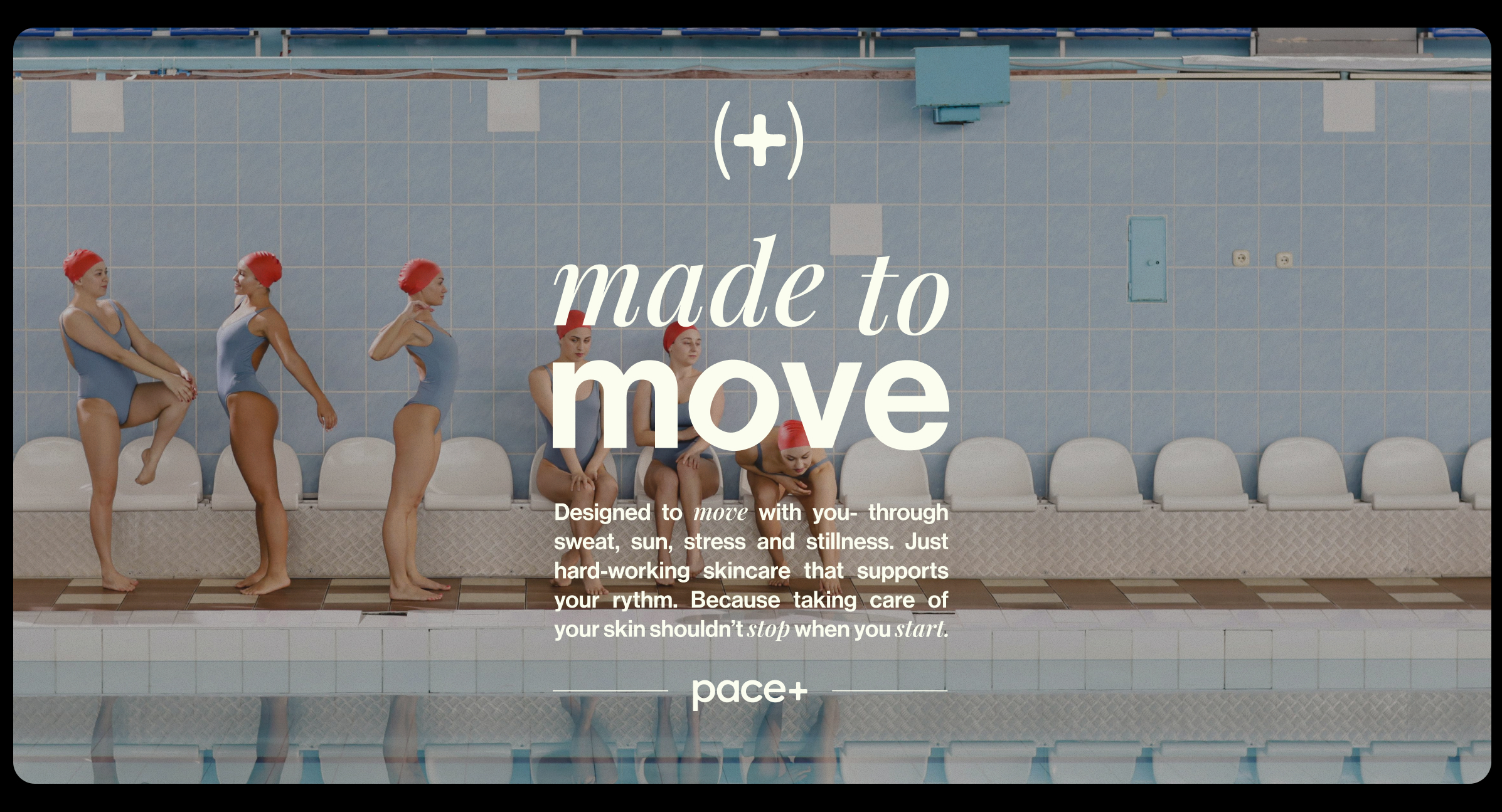
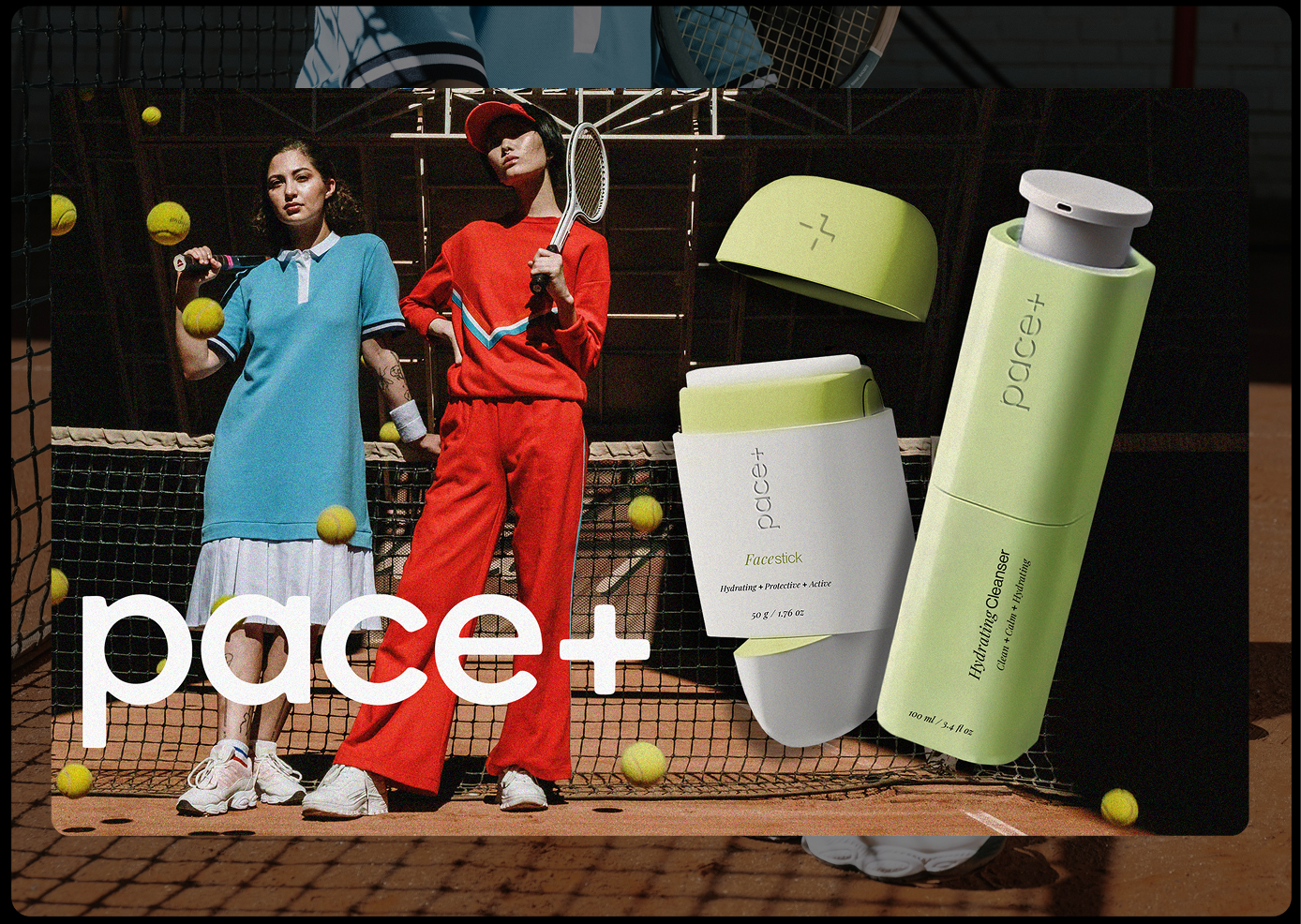
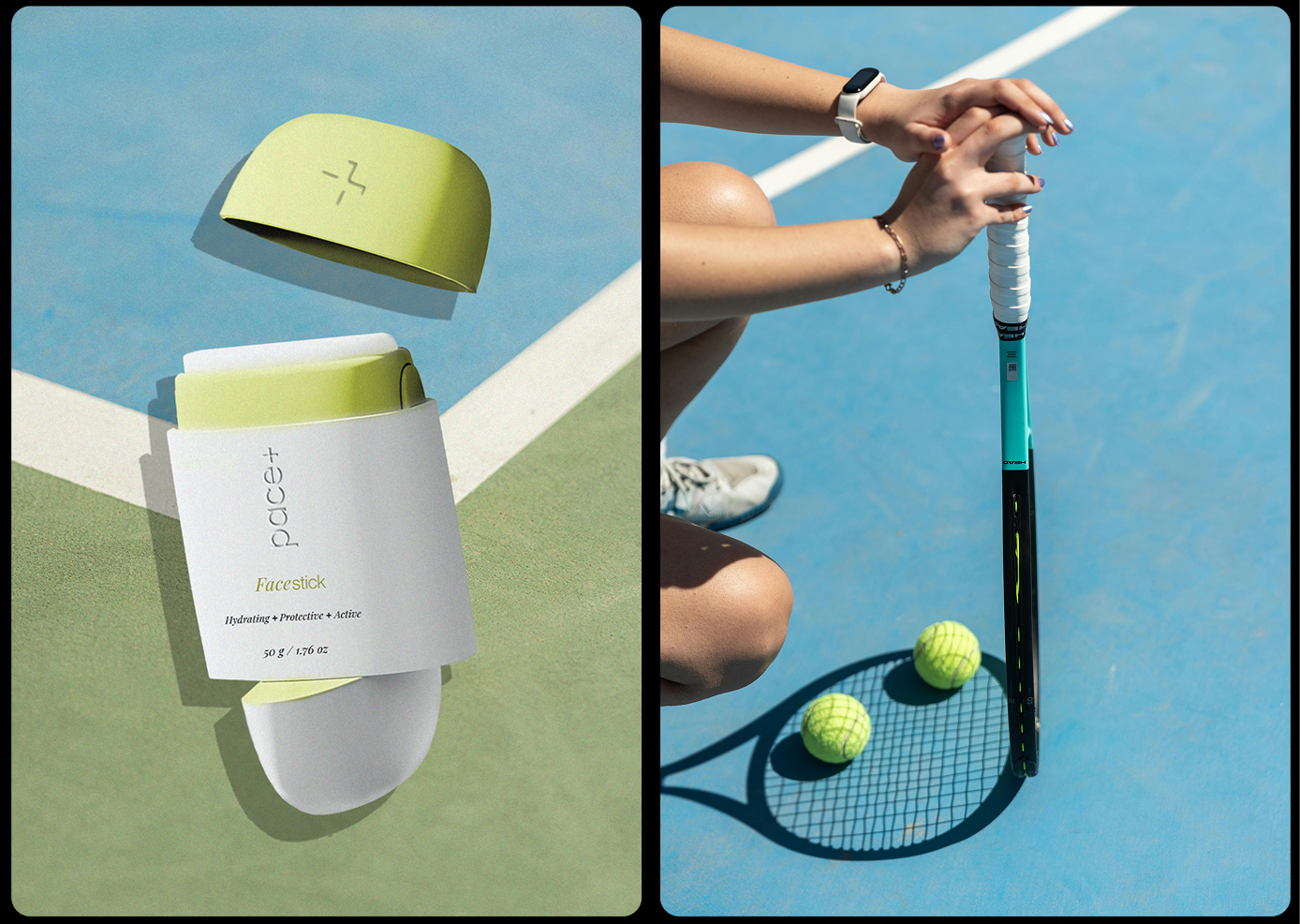
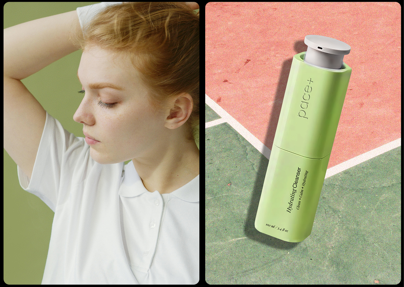
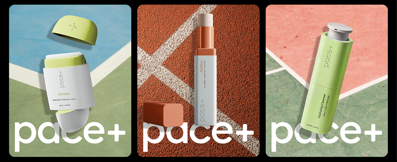
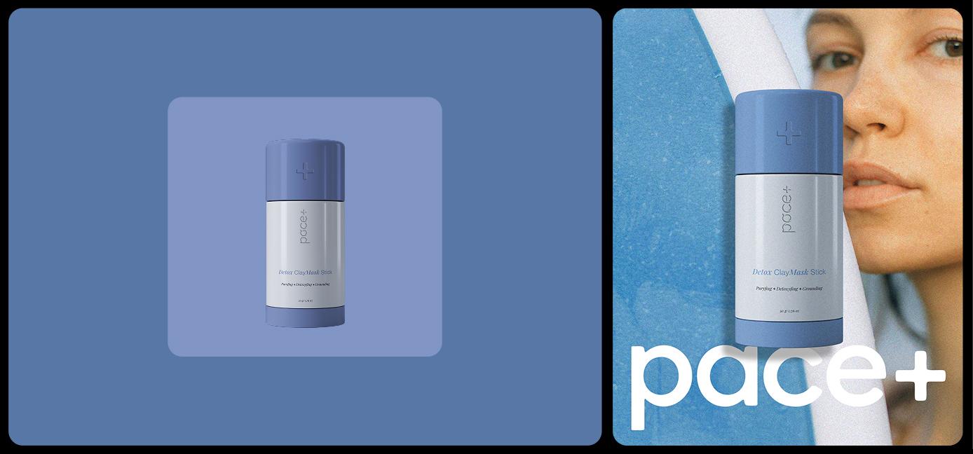
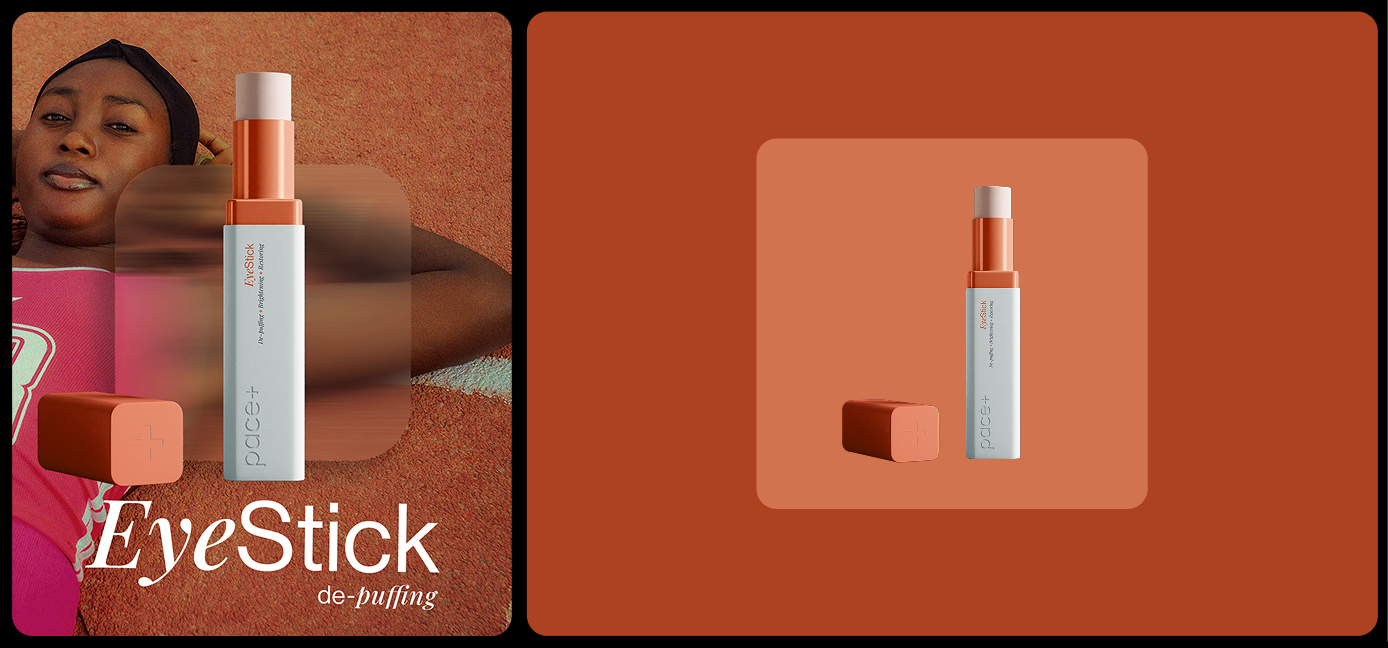
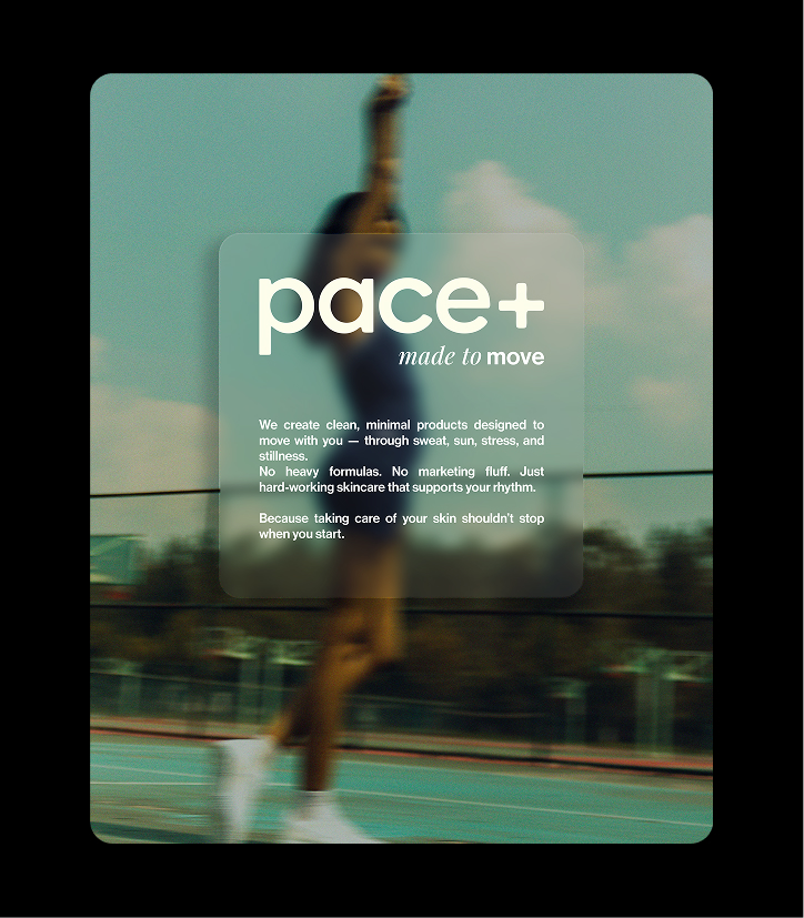
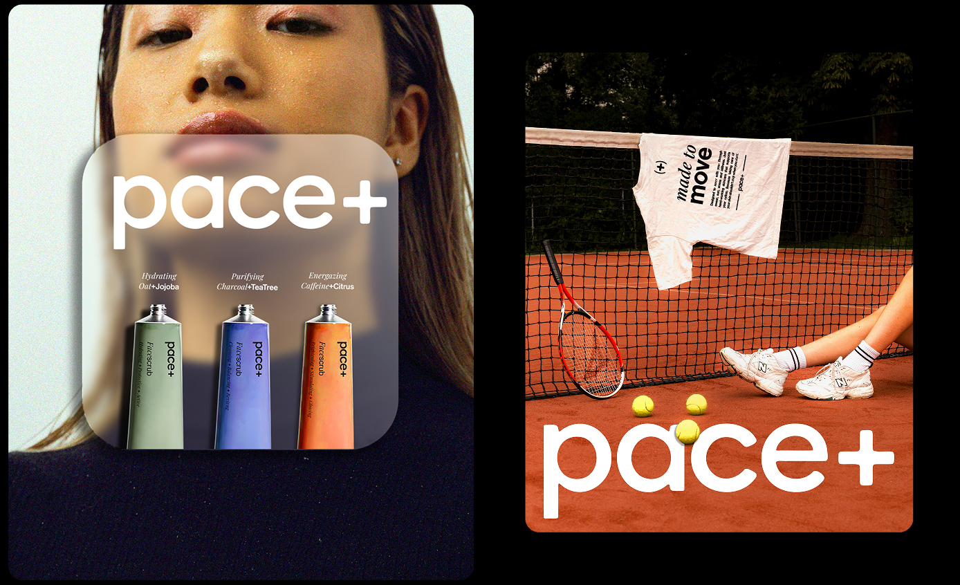
A response to a branding and packaging brief of Athlete Skincare Pace+ focused on performance, clarity, and motion. Form meets function. I designed Pace+ packaging with motion in mind — stick formats, roll-ons, and clean geometry echo the brand’s athletic purpose. The minimal typographic system supports clarity, while the color palette plays on contrast and white space for breathability, paired with bright, athletic hues to inject energy and flow.

.jpg)



.svg)
.svg)